Sightation
An all-in-one platform for writers to research, organize, and write effectively without overwhelming.
Problem
I observed that writers and students often struggle with big projects and rely on the urgency of deadlines to finish their writing. What is their workflow when coming up with a usable idea? What stops their brain clarity? What challenges are they facing at different stages of writing?
Roles
UX Research
Product Design
Prototyping
User Testing
Duration
6 Months (2023)
Tools
Figma
Miro
Empathize
Understand: what makes writers struggle when writing?
what tools do they use? what's their goal and workflow with those tools?
Research 1
• In-person Interview
• Online Surveys
Target Users
• 4 academic writers
• 4 creative writers
*Minimum 4 years of experience
Aspects to look for
• Strategies and workflow for ideas
• Challenges they’ve confronted
• Strategies for problem solutions
• Tools they use and thoughts
Research 2
• Competitive Analysis
Goals
Walk through the tools which users mentioned, and understand the features that cause their positive or negative experiences.


Note-taking application templates are great for quickly organizing references.
But it can sometime be a challenge to choose the best one from various options or to customize templates for more specific needs.


Research sites provide a deep library of resources and detailed search filters. But browsing all the text-heavy content to find the right articles is exhausting, not to mention the frustration of misguiding article titles.


Citation managers allow users to organize references and provide an instant citation generator. But users still need to import and export each source manually between research sites and text editors.

Online whiteboard like Miro has been mentioned a few times by my interviewees because of its intuitive sorting interface. Since it is mainly built for project management and collaboration, I took some of its essential features (click-drag and notes adding) as an inspiration for my writer app.
Define
What are the key insights and problems we should prioritize?
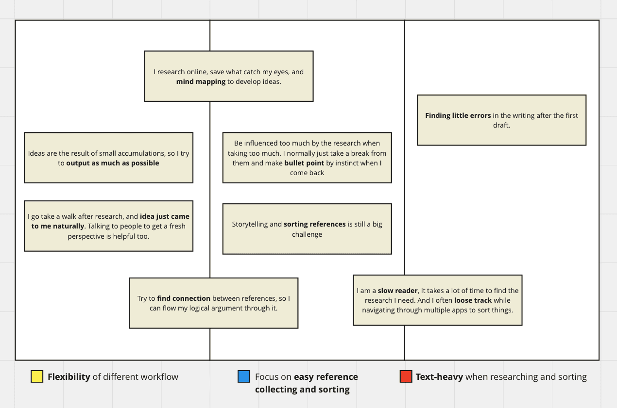
Clustered pain points to spot common challenges
I realized that most challenges are caused by “visual overwhelming.” Writers often need to spend extra energy creating clarity for themselves instead of focusing on the content they are writing.
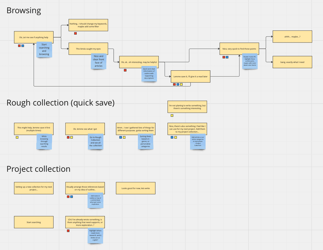
Synthesized user workflows into journey maps for different phases
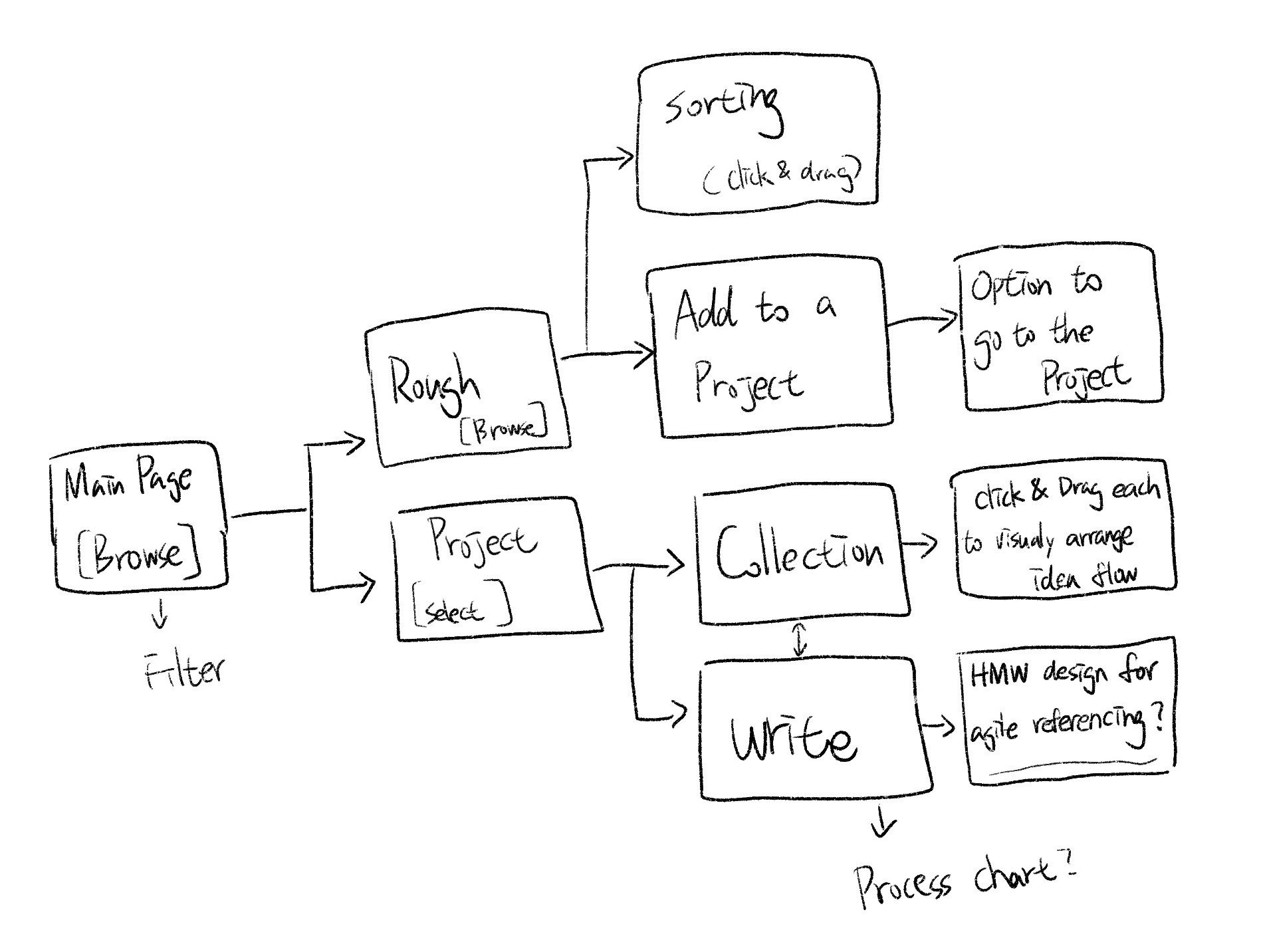
I also noted where each challenge occurs on the map. This provided me with a solid foundation to brainstorm solutions and have a holistic view to plan the information architecture.
Turn Insights to How Might We Questions
• How might we create flexibility for different workflows while designing features?
• How might we design a more intuitive visual experience for writers to collect and sort references?
• How might we ease the text-heavy issue and help writers spot the information they are looking for?
Ideate
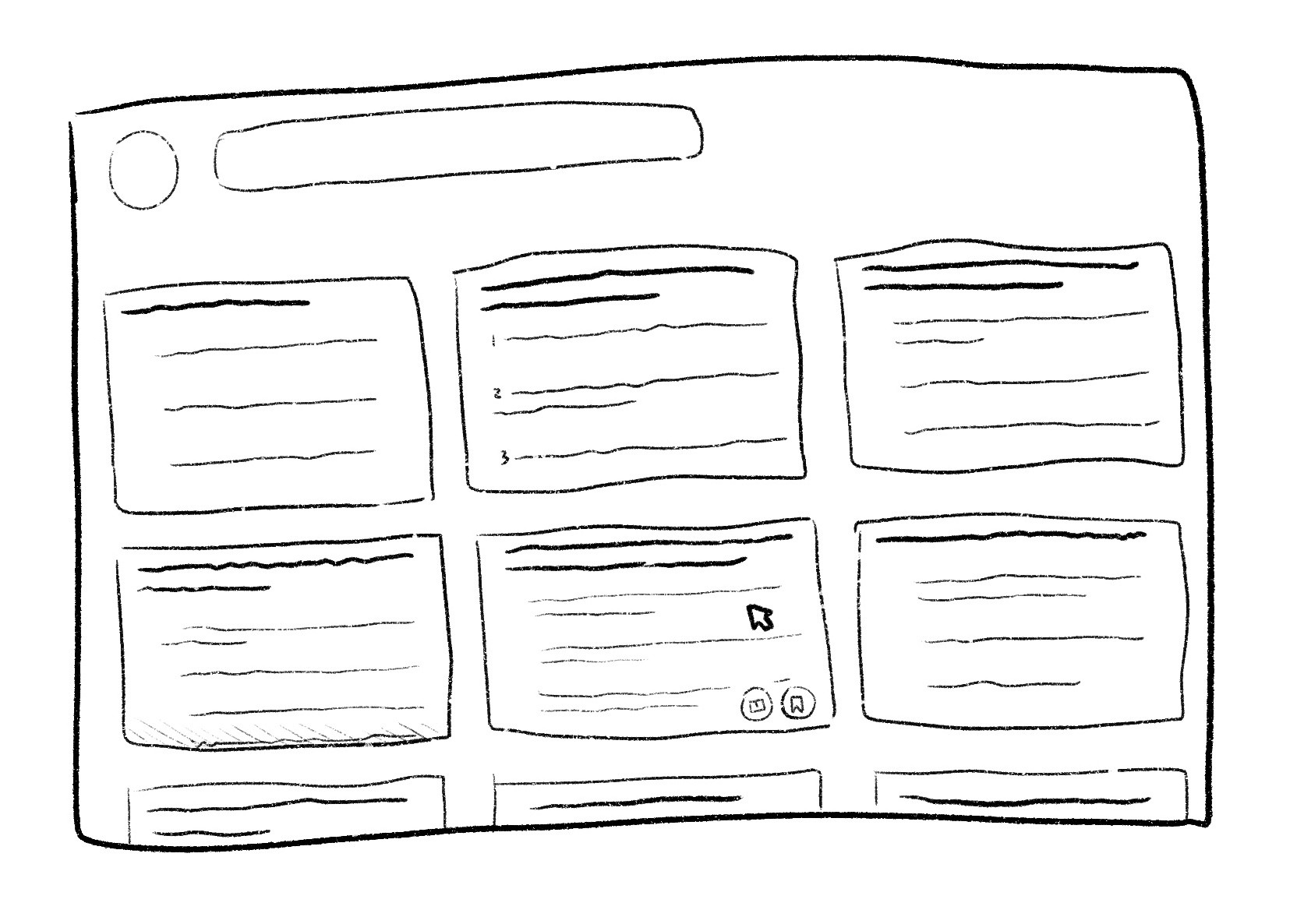
Coming up with all the possibility
Prototype and Test
Spotting problems and validating assumptions at each stage of prototype development.
Test 1
Goal and Method
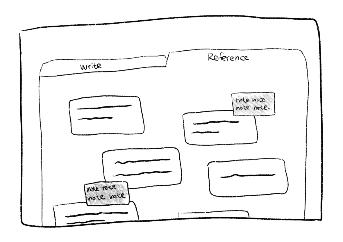
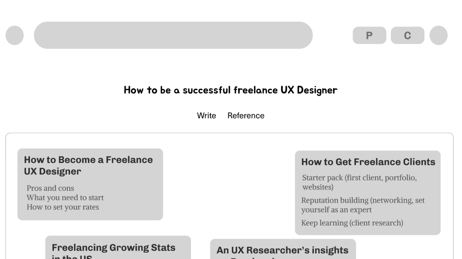
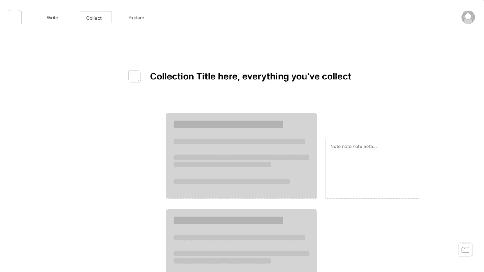
Validating an idea in an online AB wireframe walkthrough with 10 users. I was inspired by a music app which uses “tabs” to separate different phases of workflow and features. I assumed it would enhance users’ flexibility on a platform that has all-in-one features. But I need to understand how my users feel about it in a writing app.
Results
The majority of them provide positive feedback on this idea. Some of them also agree that tabs give them a playful feel. However, there was one user who was confused about the navigation in the beginning. I discovered that I could solve it by improving the visual hierarchy.
Test 2
Goal and Method
Understand the overall experience and where can be improved. In the in-person usability testing with 4 users, I created a list of tasks, asked them to go through each of them, observed their behaviour, and gathered their feedback.

Results
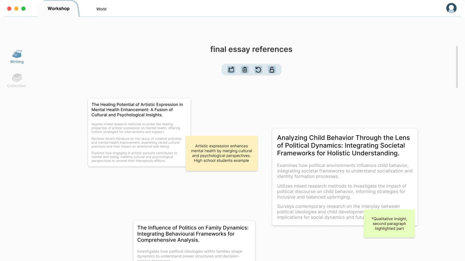
All of them were able to complete tasks. However, they also hesitated when accessing the toolbox on the research collection page. So I relocated and expanded the button to make it more visible and self-explanatory.
Final Design and Solution
01
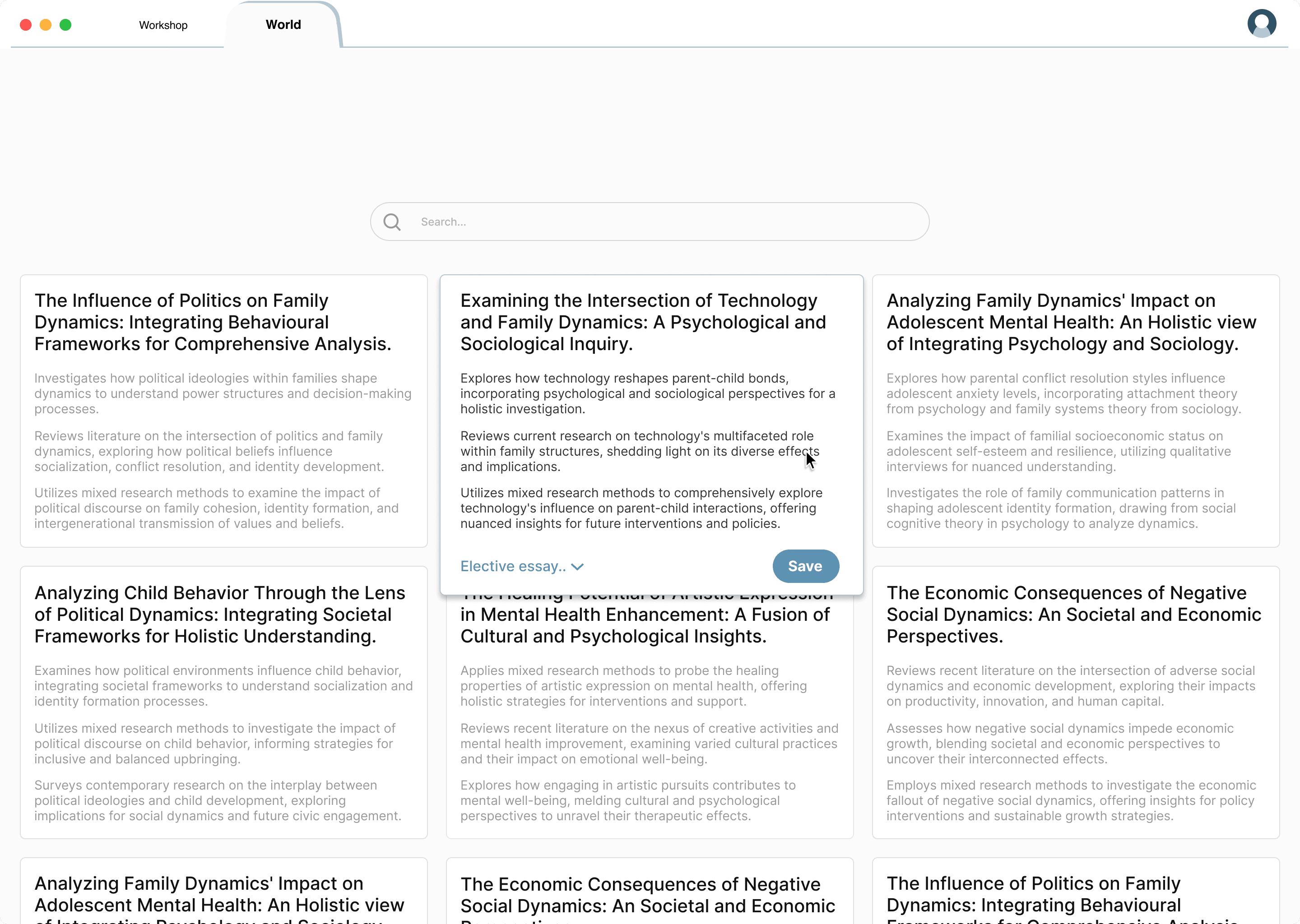
Browse articles with bullet points
AI-generated bullet points allow search results to be shown as “text blocks”, which allows writers to quickly grasp an idea of an article and browse more options at one glance.
02
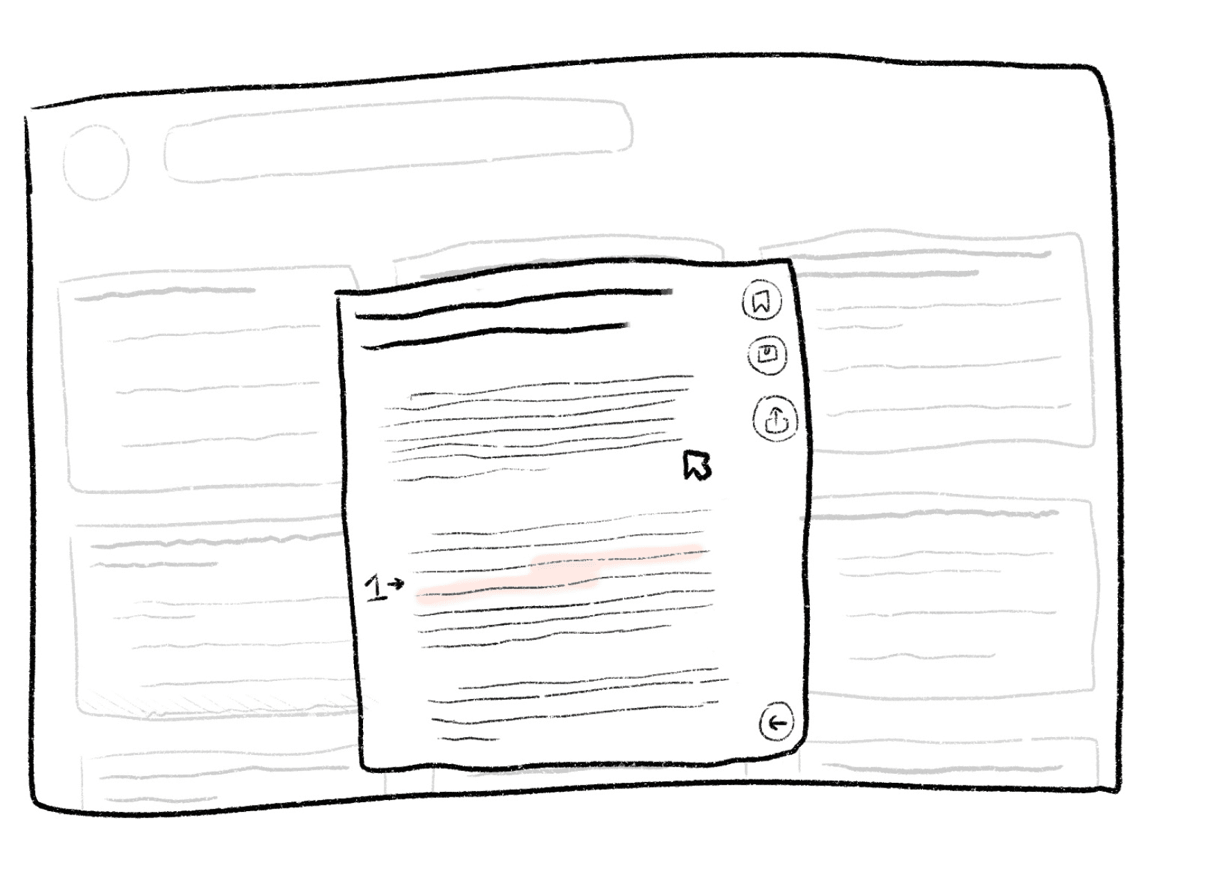
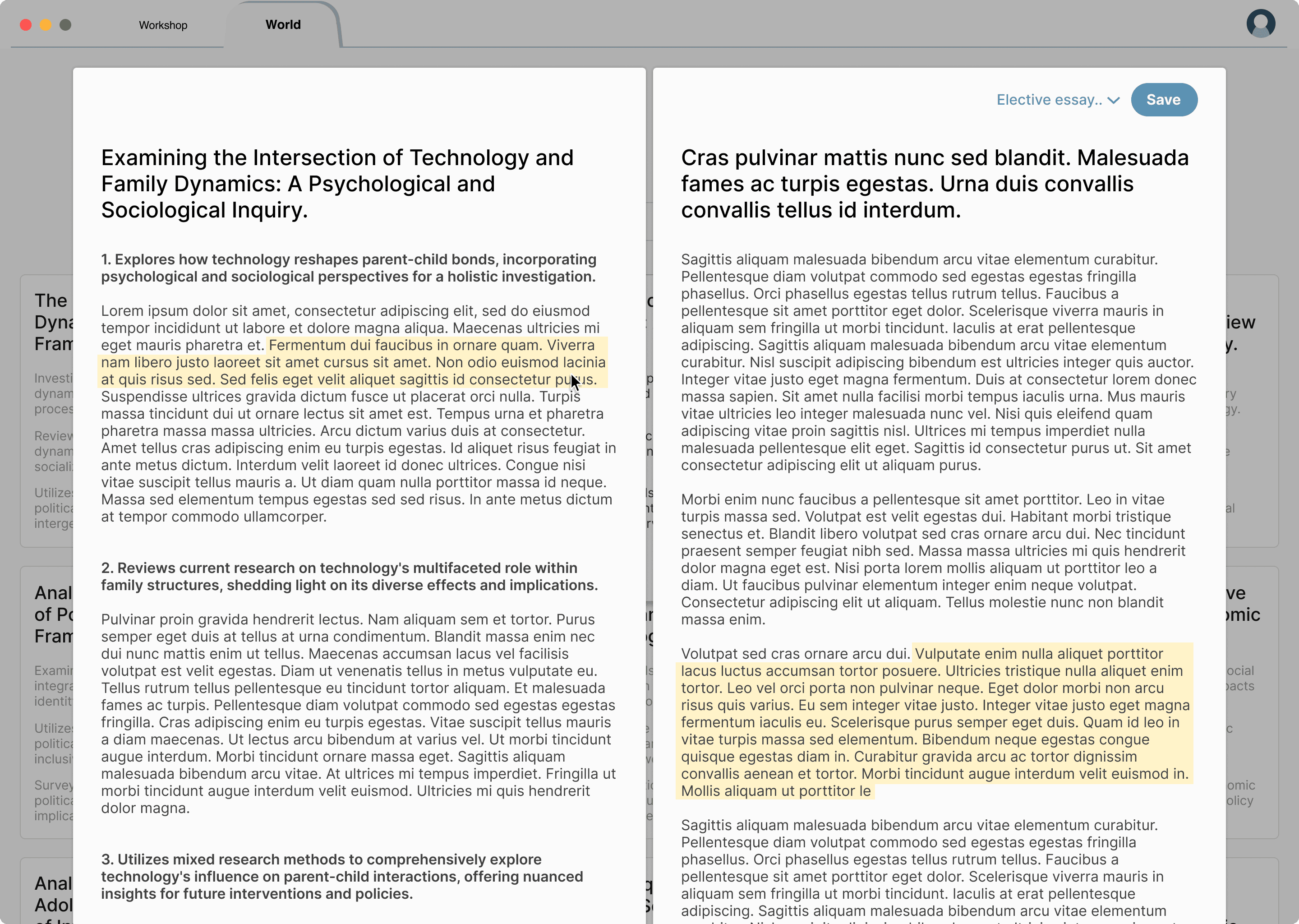
Read articles with a summary aside
Once open an article, the right side shows the original article, and the left side expands each bullet point to a summary. Users can hover over the summary texts to spot the corresponding content in the original article.
03
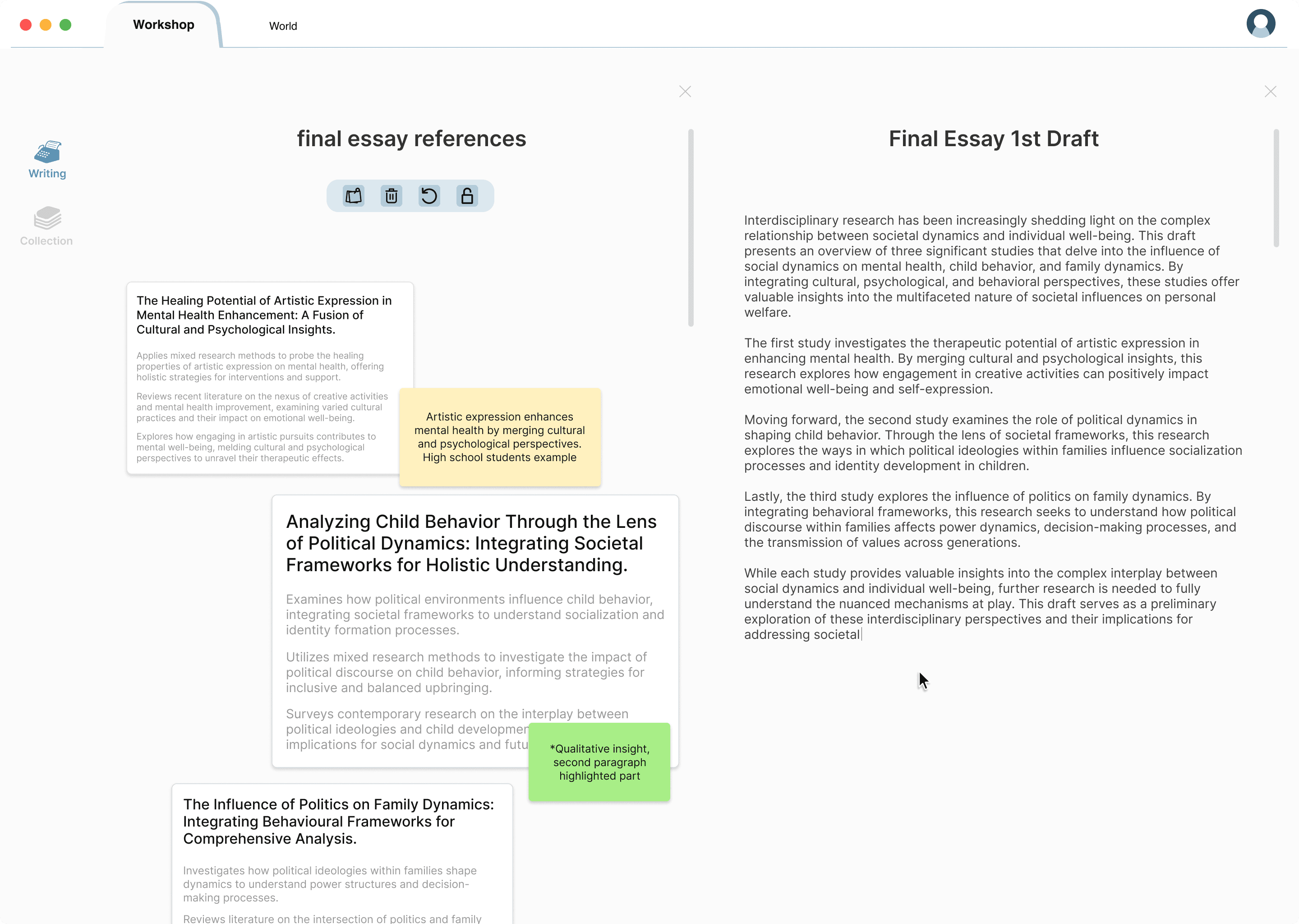
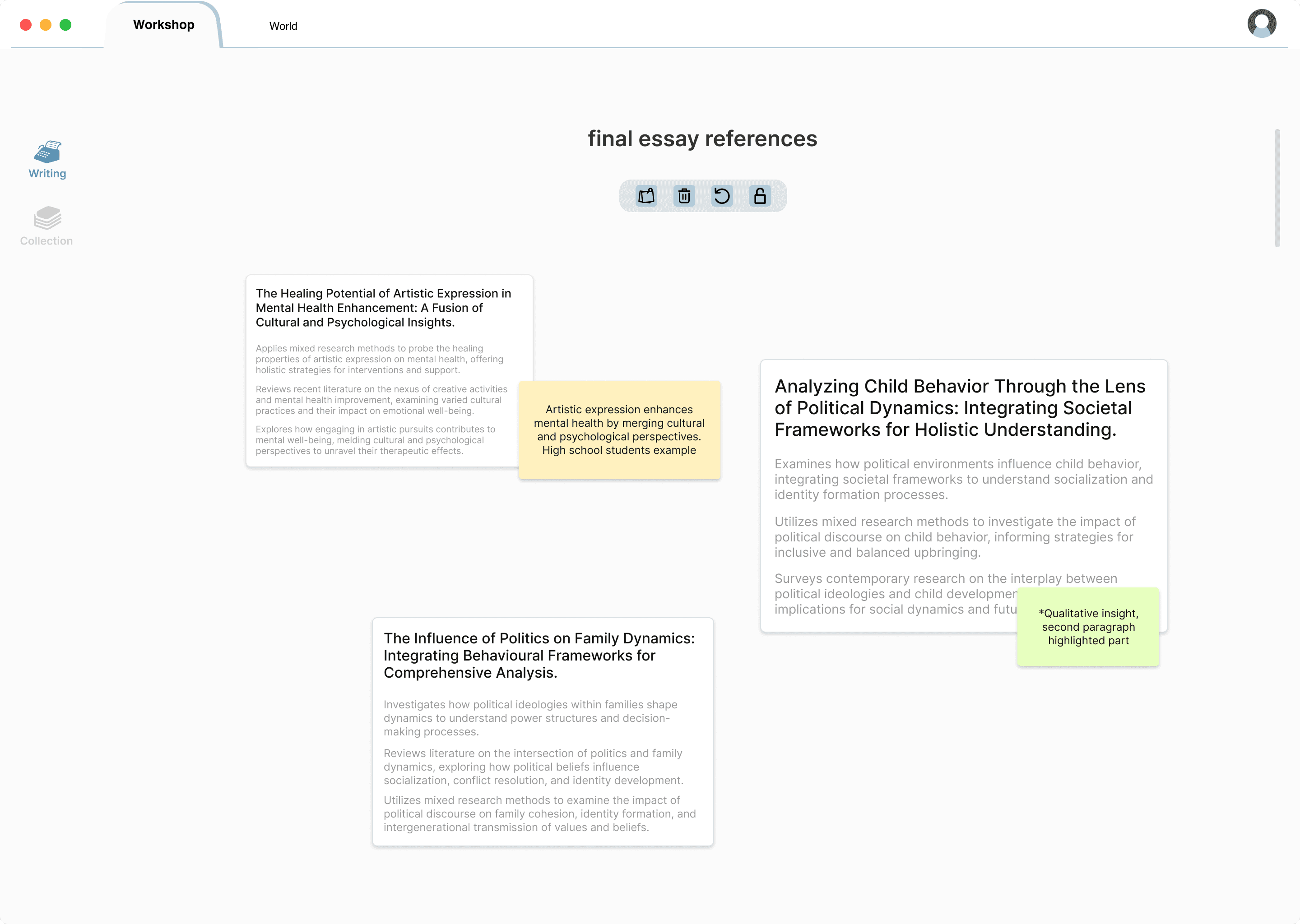
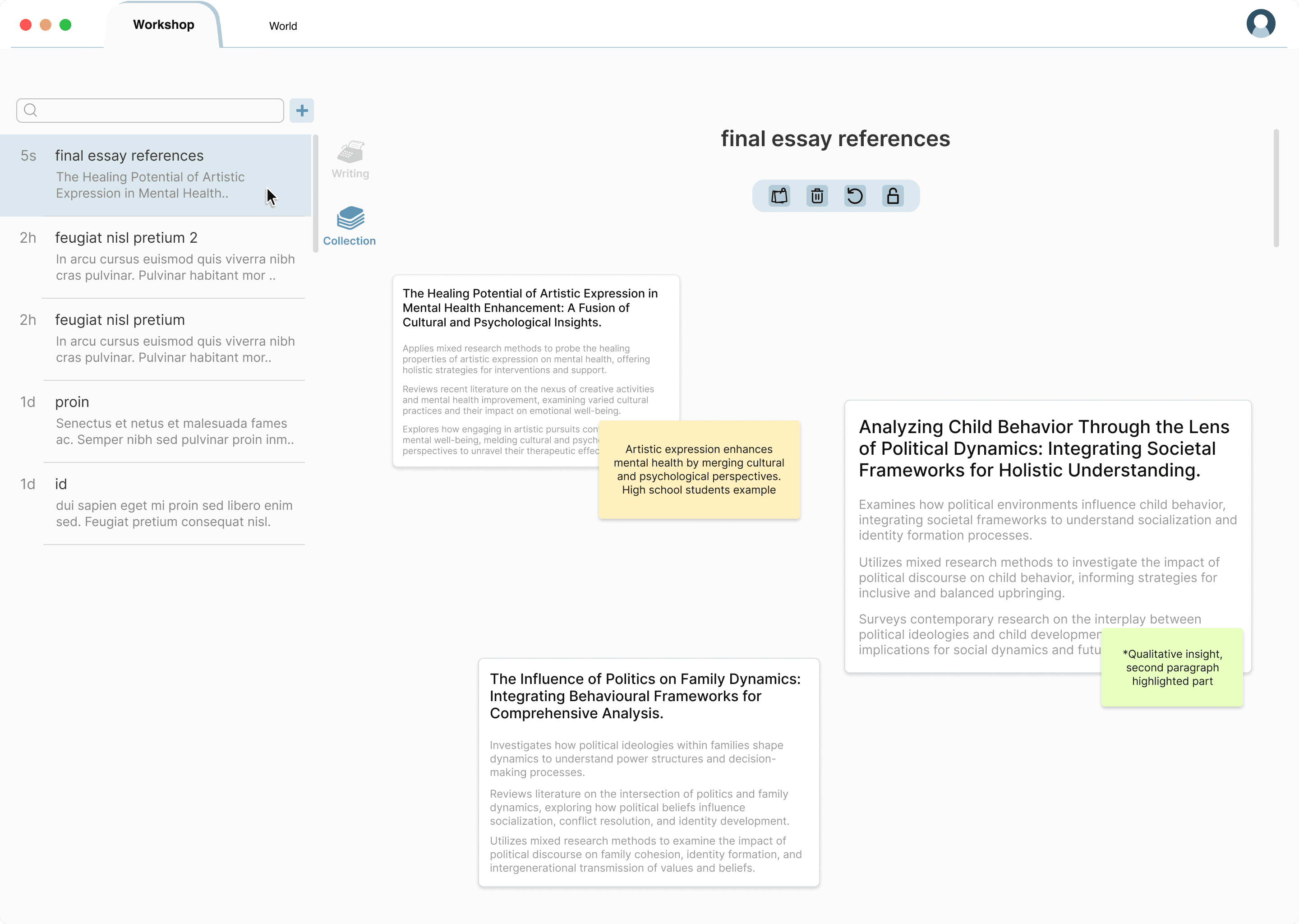
White board for references sorting
With “bullet point blocks”, saved articles can be easily organized by clicking and dragging. Users can also add notes next to their sources.
04
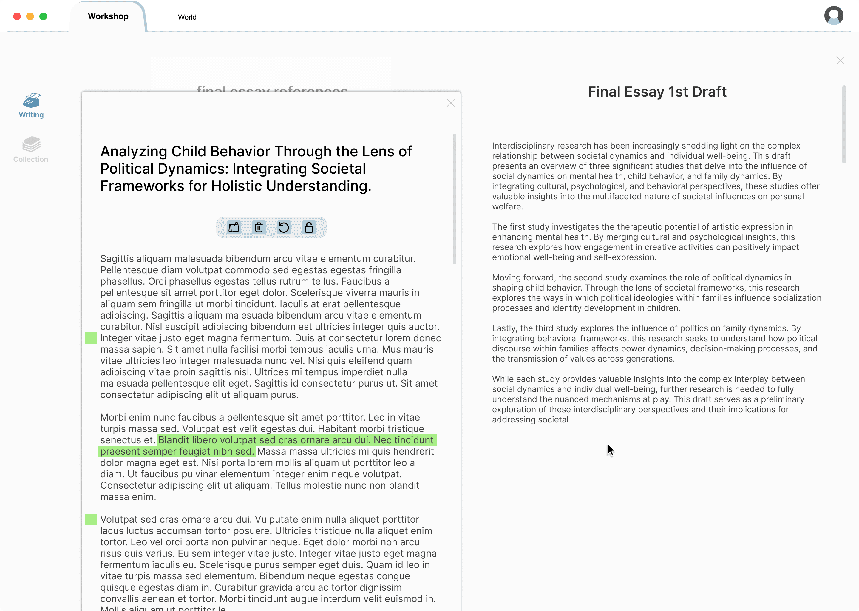
Write in split-screen
Simply drag a writing file next to the whiteboard to multi-task with clarity.

Thank you for your time!
Contact: brandonli.tw@gmail.com